Fieldwork Group
logo | editorial
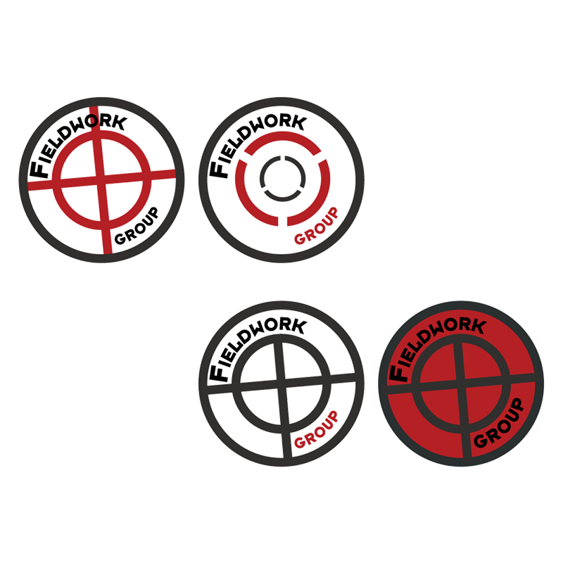
Fieldwork Group wanted to modernise their logo while maintaining their existing red, white and black colour scheme, as well as the presence of a target. They also wanted a redesign of their product catalog to update their inventory, incorporating the new logo.
Logos
I went through a variety of options for the logo using shields and circles to show the hardy nature of the brand and keep the target of the original logo. The two final outcomes I reached were the skeleton key design, intended to represent the wide range of products they supply to fit various construction needs, and the more simple target replacing the “O” in Fieldwork. They decided to proceed with the latter of the two.
Product Catalog
I used the same red, black and white colour scheme for the catalogue. The majority of the information came from the old catalogue, although they wanted the layout to be changed significantly.


