Beard & Body Care
print | packaging
Unique by Yoggiebear is a new and exciting online store that offers a variety of products in the beauty and skincare range. The store fills a niche in the realm of natural skincare for men, offering organic, locally-made products such as beard and mustache care, scented candles, and natural soaps. The target audience for the Yoggiebear team is men who prioritize self-care, but they also anticipate a substantial number of female customers. Their goal is to grow by introducing more and more exceptional products into their range.
The idea behind the project was to design a series of labels for their men's beard, body, and senses care. The store already had a logo that they wanted developed further and incorporated into the branding. Being a part of the LGBTQ community, they wanted to make use of bright colors, particularly in their logo, while also appealing to a wide range of men who take pride in their appearance. They want to create a brand that stands out and to make a bold statement.
Logo Redesign
To kick off the branding process, I started by enhancing the bear logo that was already in place. To make the logo more striking, I incorporated a light source to create highlights and shadows, giving the bear a more dynamic and three-dimensional appearance. I also made some adjustments to the color scheme, while still staying within the same color palette.
The inspiration for this logo design came from the imagery of a setting sun behind the bear. The goal was to infuse the logo with an outdoorsy and natural feel, while still incorporating bold and vibrant colors. To ensure versatility, the color scheme was kept consistent across different products, while the text color remained unchanged in both versions. To enhance the overall aesthetic, different fonts were experimented with, including a combination of a masculine script font with a bold slab serif for the three options. In this particular version, a more simple and hand-written font was chosen for the lower part of the logo, to further emphasize the rustic and natural feel of the brand.
In this logo, I once again paired a script font with a serif font and added a line to separate the two. I positioned "Yoggie Bear" closer to the beginning of the line to create balance and visual appeal. To accommodate for limited vertical space, such as website headers, a version with the text placed to the side of the bear was also created. Both fonts used in this option were selected for their stylish and sophisticated aesthetic, with the aim of giving the logo a more premium feel.
This option builds upon the previous by using the bear to separate the two fonts instead of a line. The text was also curved to better align with the shape of the bear, creating a cohesive and visually appealing design. However, this technique does present some limitations, such as difficulty in placing the text next to the bear. To address this, an alternative approach is to straighten the text when it is placed alongside the bear. The fonts used in this option strike a balance between the previous options in terms of elegance and clarity.
Label Design Process
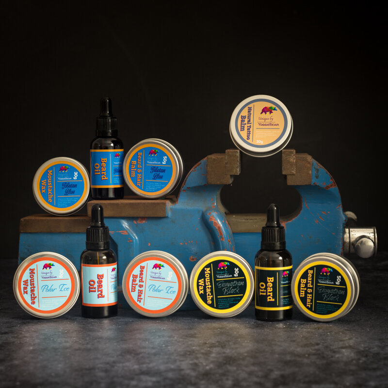
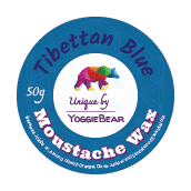
After finalizing the aesthetic direction for the logo, I proceeded to generate designs for the product labels. Utilizing the third option as the foundation, I carried the design across the entire range of labels, introducing three distinct variations: Tibettan Blue, Sumatran Black, and Polar Ice. To enhance the differentiation among the variations, I incorporated varying typefaces in conjunction with the color scheme.
The design concept was relatively straightforward, featuring a prominently displayed logo in the center of the label. While the font and color scheme used for the product name (Tibettan Blue) may vary among the different products, the font used for the type of product (Moustache Wax) should remain consistent across all variations. To achieve this, I utilized white as the font color. After completing the initial design, I later returned to it and incorporated a purple shadow for the "Moustache Wax" text to give it more distinction.
A bolder approach was taken in this design, with the logo separated from the other elements on the label. The name "Moustache Wax" is prominently featured and is the first thing customers will notice. This is crucial, as the name can be conveyed through the overall color scheme, but it is equally important for the customer to quickly identify the product itself. I incorporated the same "Flower of Life" pattern as in the first option, but selected a contrasting color from the color wheel to make it stand out. The result left the sides of the label looking relatively empty, so I repeated the pattern, using a darker blue to make it less prominent, and rotated it to differentiate it and better fill the sides. The more complex design necessitates the creation of a smaller label to be placed on the back of the container, including the ingredients.
The final design option strikes a balance between simplicity and boldness, utilizing the contrast from the previous option. The name "Moustache Wax" is prominently displayed, ensuring that customers can immediately identify the product. The white background of the logo also serves to make it stand out. The contrasting color used for "Moustache Wax" will need to be changed for the different colored products, but the highlight color can remain the same, as it is the YoggieBear Purple from the logo. This design choice is ideal for customers who are looking for a quick way to identify the product from the line of products that they are looking for.
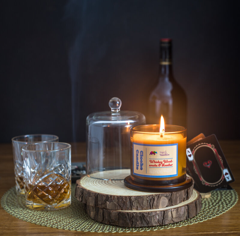
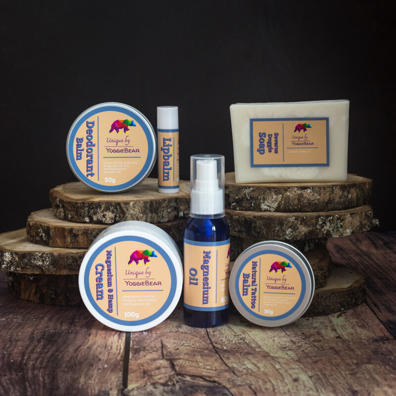
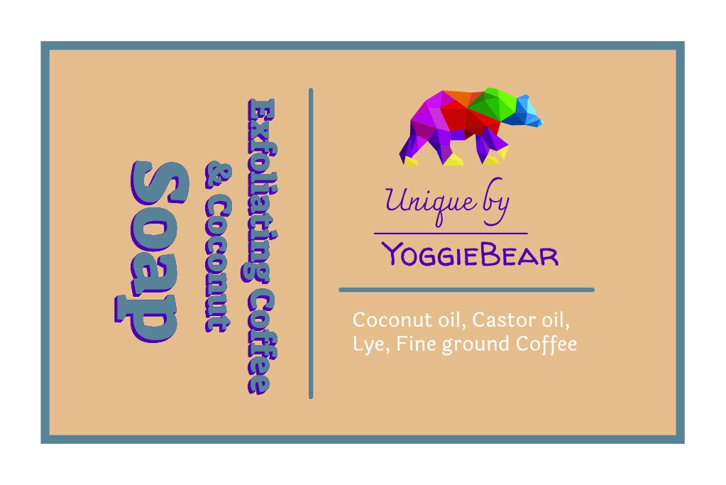
Once the hair product labels were designed, I applied the same design principles to the full range of skincare products, ensuring a cohesive and consistent color scheme throughout the entire product line. This approach was also replicated for the line of scented candles offered by Unique by Yoggie Bear, resulting in a unified brand aesthetic.
In Action
To ensure a polished and professional appearance for the product launch, professional photography was an essential component of the preparations. Utilizing professional photographs enabled them to kick-start marketing efforts on social media and with printed materials. Having high-quality photographs of the products allowed us to showcase them in the best possible light and attract potential customers' attention. It also helped us to create a consistent visual identity across all marketing channels.
To capture the perfect shot, we enlisted the expertise of Catchlights Photography for the task. We knew that they have the experience and skill set to create visually stunning photographs that would accurately reflect the quality and uniqueness of these products. They delivered photographs that exceeded our expectations. The photographs were not only beautiful but also captured the essence of the brand to connect with the target audience in a more meaningful way.
